Overview
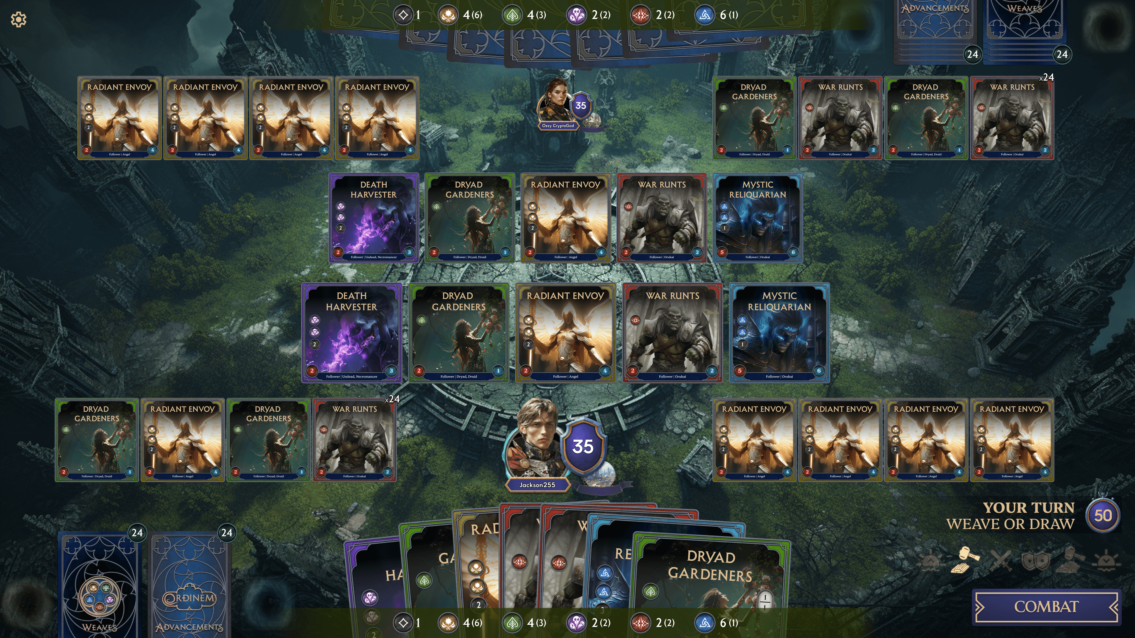
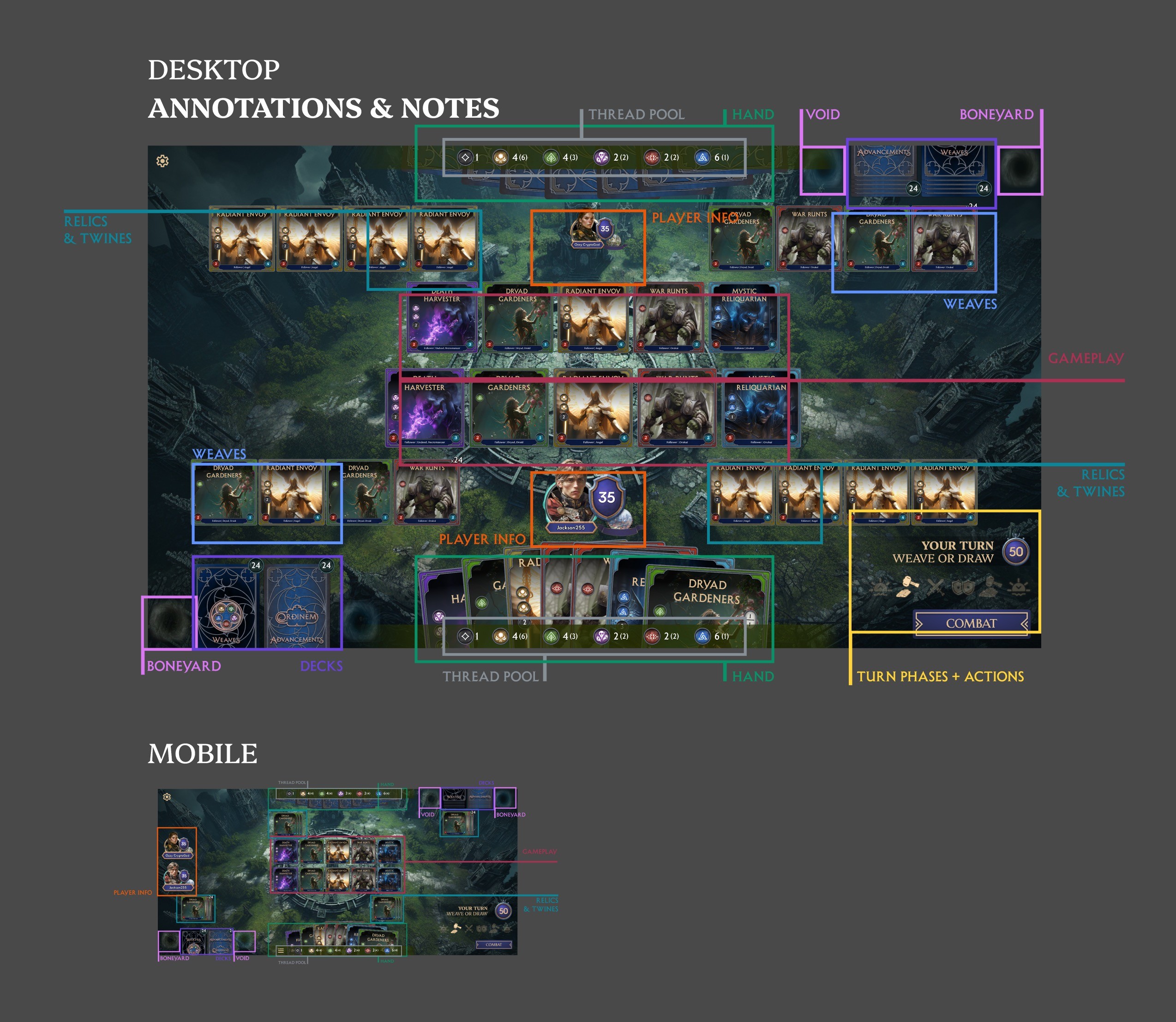
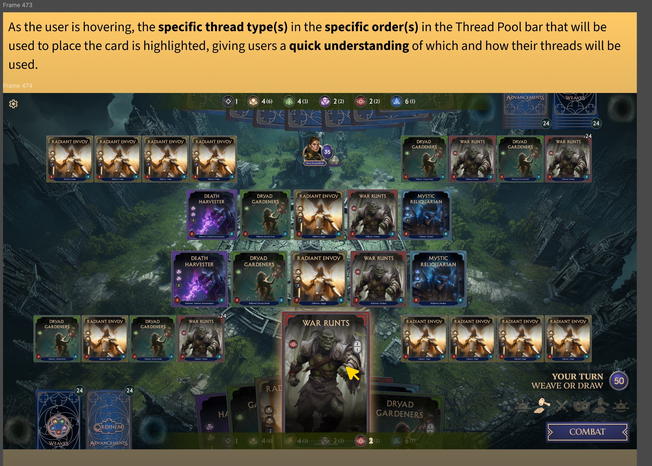
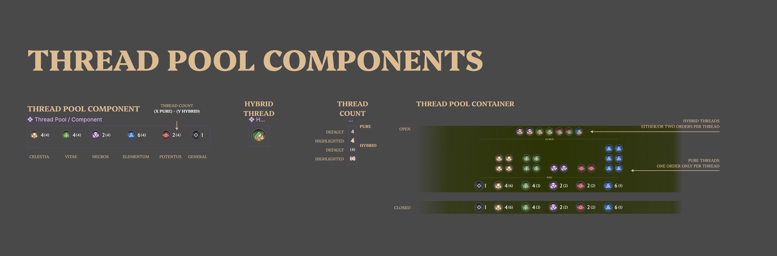
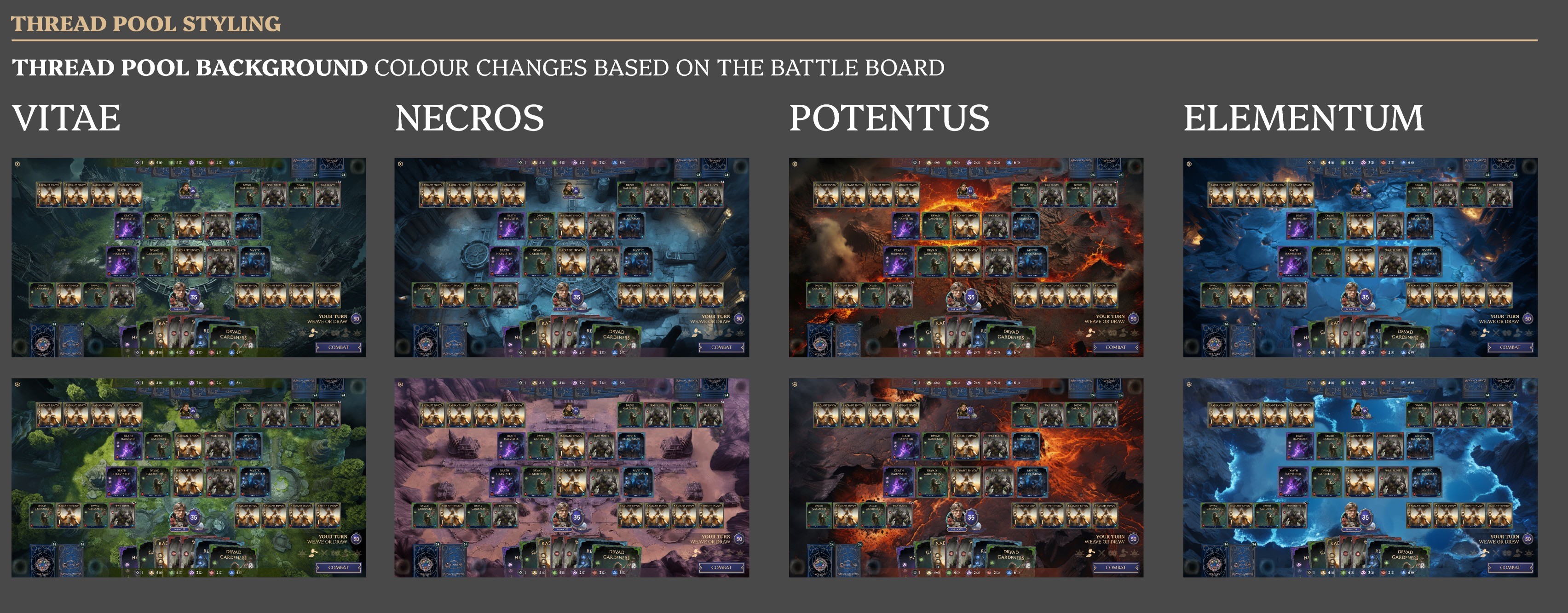
Thread Pool Visualization Redesign: I tackled a major UX challenge around the thread cost system, a core mechanic that determines which magical resources (threads) are consumed when playing cards. The original system was confusing and generated numerous player complaints because thread costs were positioned far from relevant cards, users couldn’t see which specific threads would be consumed, and the connection between cards and resources was unclear. My solution involved repositioning the thread pool closer to cards for better relevance, displaying only top-level counts at a glance for quick scanning, implementing hover states on cards to show exactly which threads would be consumed and in what order, and adding an expanded hover view to give users a comprehensive understanding of all available threads. This redesign was particularly well-received by the game design team, who had been stuck on how to solve this problem.
Outcome
Thread pool redesign and board layout improvements are currently in development, with mobile versions also in production.
Work received positive feedback from we, particularly from game designers who had struggled to identify a clear solution to the thread pool usability issues.
What I learned
Working on Ordinem taught me the critical importance of understanding when to show information, not just what to show. Second-by-second gameplay decisions require different information at different moments, and having a deep understanding of game flow is essential to knowing what to surface when. You can have all the UI in the world to convey information, but if you don’t present it at the right time in the decision-making process, it becomes noise instead of clarity.